In the last post I showed two different designs and approaches for taking notes in lectures. They both have their advantages and drawbacks. It was important to also consider that Andrew's needs are different in lectures and out of lectures. In lectures times are constrained and it is possible for important information to be conveyed while Andrew is trying to do something else. While he is trying to get a photo of a worked example on the board the lecturer may be talking about a related but different concept that also should be included in the notes. This makes it important that actions are not atomic, that a task can be temporarily paused whilst a higher priority task is addressed.
This is not true when reviewing and editing notes outside of a lecture, here Andrew has considerably more time to complete tasks and it probably is best not to encourage him to jump around too much.
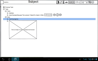
 The outliner approach does not really need any adjustment from inside to outside of lectures, the non-text elements (images and sound bites) can easily be covered in surrounding text. The only obvious visual difference is that the Outliner does not need the sidebar in this mode.
If I choose to go with the outliner process, it is probably not really worth differentiating between the two different modes of lecture creation. The only consideration is whether or not it is worth removing the sidebar to provide more screen real estate.
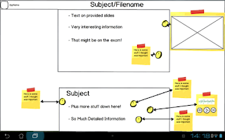
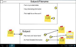
The annotator is a lot more hungry for screen space. In the lecture, new notes are created by tapping the screen, creating those yellow dots. Only the note that is currently being created/edited is expanded.
Outside of the lecture, the default is for all notes to be expanded, this also means the app automatically rearranges the notes to remove any overlaps. When the notes are expanded they should not obscure any elements in the original notes nor should they obscure other expanded notes. The idea here is that the yellow dots remain but an arrow is automatically generated pointing to the expanded note. Expanded notes are automatically sized based on the amount of information contained.
A short tap will hide the expanded note. Which allows Andrew to hide information he is not currently trying to revise this will also cause nearby notes to try to automatically rearrange themselves.
A long tap brings up the note into a much larger mode for further editing. It is here where the editing tools are found, primarily based around adding and formatting further text. The plan is to use pretty standard text editing settings, the ability to change font size, bold
There aren't any plans to include picture or audio editing tools here. A further long press on the non-text element in a note should allow Andrew to open the image/sound in another application on the device that has told Android that it is an app that can handle pictures or sound. Ideally he will then actually choose an image editing app rather than a gallery or music playing program.
Again, I would be very interested in hearing feedback on this design.
In order to try to encourage comments on this series, the best comment on any post on my blog with the design tag made before 11:59PM on 12/07 will get their choice of The Orange Box, The Ship or Cthulhu Saves the World and Breath of Death. Provided they also provide me with contact details.
This is not true when reviewing and editing notes outside of a lecture, here Andrew has considerably more time to complete tasks and it probably is best not to encourage him to jump around too much.
Outliner
 The outliner approach does not really need any adjustment from inside to outside of lectures, the non-text elements (images and sound bites) can easily be covered in surrounding text. The only obvious visual difference is that the Outliner does not need the sidebar in this mode.
If I choose to go with the outliner process, it is probably not really worth differentiating between the two different modes of lecture creation. The only consideration is whether or not it is worth removing the sidebar to provide more screen real estate.
 PDF Annotator
The annotator is a lot more hungry for screen space. In the lecture, new notes are created by tapping the screen, creating those yellow dots. Only the note that is currently being created/edited is expanded.Outside of the lecture, the default is for all notes to be expanded, this also means the app automatically rearranges the notes to remove any overlaps. When the notes are expanded they should not obscure any elements in the original notes nor should they obscure other expanded notes. The idea here is that the yellow dots remain but an arrow is automatically generated pointing to the expanded note. Expanded notes are automatically sized based on the amount of information contained.
A short tap will hide the expanded note. Which allows Andrew to hide information he is not currently trying to revise this will also cause nearby notes to try to automatically rearrange themselves.
A long tap brings up the note into a much larger mode for further editing. It is here where the editing tools are found, primarily based around adding and formatting further text. The plan is to use pretty standard text editing settings, the ability to change font size, bold
There aren't any plans to include picture or audio editing tools here. A further long press on the non-text element in a note should allow Andrew to open the image/sound in another application on the device that has told Android that it is an app that can handle pictures or sound. Ideally he will then actually choose an image editing app rather than a gallery or music playing program.
Again, I would be very interested in hearing feedback on this design.
In order to try to encourage comments on this series, the best comment on any post on my blog with the design tag made before 11:59PM on 12/07 will get their choice of The Orange Box, The Ship or Cthulhu Saves the World and Breath of Death. Provided they also provide me with contact details.


So, here are my comments about the PDF annotator:
ReplyDeleteIt's nice having the notes scattered on the slides is great because you're giving the context but it doesn't allow me to easily scan all my notes quickly. Even though it's ugly but the notes panel of the adobe reader but you can see a condensed and expanded version of your notes, the time it was written, who wrote it. These are great in that they give you context about the note, which is sometimes what you need to look for something in particular. I like the idea of tagging notes, but I question the use case around this. Sometimes when I'm note taking i have to go so fast to capture important points down that I can't be bothered/have the time to make notes about my notes(or in this case, tag them).
I think it would also be great if you were able to search your notes. I can think of a use case when this would be useful: "I know the lecturer said something about [x] and I wrote down something important about it but I can't remember when/where he said it". In this case a High-level overview of the notes would also be a great feature. The point of the high level view would be to help me pinpoint something I've noted or recorded when going back over my notes. Some features (in addition to search) that I think might be useful could be:
- Indicator of the type of note: written, audio (normal vs 90s-that was important), photo
- Time stamp
- Tags
- Filters
- Summary of notes based on slide (e.g. Slide 1 has 2 notes and 1 audio, slide 2 has 3 audio recordings)
- for notes it would be good to have several levels of detail - 1) just the note reference 2) snippet/ first few words 3) entire note 4) tags
I agree that tagging in a lecture is not really a realistic approach. Manual tagging is something that is an optional post-lecture modification to a set of notes.
DeleteThe automatic meta-data you suggest is pretty useful for searching and seems like a good idea.
This comment has been removed by the author.
ReplyDeleteYet more comments. This time about the outliner.
ReplyDeleteGreat idea but there are two issues that i can see with this:
Having an expandable/collapsible tree structure means that I have to constantly click on handles to see more detail. I get an overview, but it's limited to the very top level. Youreforcing people to drill down into hierarchies to be another level of detail. You've got so much space on the screen - use this to your advantage. :) make use of the space to give yourself a larger hit are for handles. They don't necessarily have to be handles, the could be something else. Things could be in panels where the touch area is maximised to fill entire row e.g. Pages dedicated to FAQS often allow you to click on the entire question in order to expand it to show more.
Tree structures confine me to a hierarchical view of the notes I've made. It'd be great if I could re-arrange the outline into a format that best suits the task that I'm doing. I don't think full customisation of the outline view is necessary, but some options that allow you to explore your notes in different "views" would be useful. Each view is designed to best assist the task I'm doing. For instance, what if I was looking for a worked example of a formula that the lecturer was explaining on the board. I knew that i took a photo of it sometime about halfway through the lecture. But, I remember taking lots of photos during that time. This worked example though was different - he had no space left on the blackboard and needed to keep stuff that was already written up there, so he ued the whiteboared. If I had something like a timeline where I could see a preview of notes or othumbnailof photos I could easily scan through my notes looking for a photo that's predominantly white and that's taken about halfway through the lecture. Time is just one metric here. Others could be tags, type of note (audio, photo, written), date/time of lecture, place of lecture (you could be in a different room), people who you went to the lecture with, what you wore that day :D. It doesn't have to be just about the notes.
One thing that I think could help you in this design process is capturing key use cases that are important. These will give you a metric for measuring how well your design meets user needs. I know you've thought about these in your personas but what's missing it how your solutions tie back to these use cases and address/fail to address them.
Hope that helps! :)
The handles is something that arises from the tools that I am using. Certainly the hitbox for the handles should be quite generous. The idea of using an entire line is a good one, though it then conflicts with the ability to go back and select a line to edit, will need to think through the appropriate control structure. The keyboard is pretty straight forward, but going down to mouse or hand gestures chagnes things.
DeleteI like the idea of taking the outliner approach and then allowing for different views of the same information.
I should go through and explicitly link each of my use cases back to the persona. It should probably be another post in this series.
Thanks for all of the feedback!