Given the feedback I have received regarding the purpose of notes, I have formulated 2 designs based around two different approaches. I am going to focus on the Lecture Mode note taking UI for this post. I was reminded by a friend at lunch that I don't need to use the same UI for both lecture mode and (re)viewing.
The Lecture Mode Sidebar
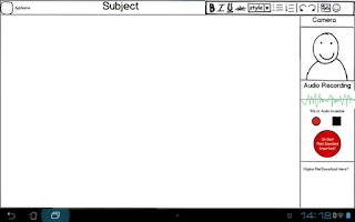
 The Lecture Mode sidebar is meant to allow for easier and faster photo and audio integration into notes. The key idea is that taking a photo or performing audio recording should not be atomic tasks (i.e. a task that has to be both started and completed before other actions are taken). The standard android conventions for photography involve literally moving the user into a photo taking application (which occupies the entire screen) and only returning once the photo has been taken.
The camera pane in this sidebar will show a live thumbnail of whatever the rear facing camera is showing. A single tap will take a photo and add it into the notes, pinching will zoom the camera in and out, and a long press will bring up a menu with basic camera controls (most importantly a control to swap between multiple cameras in case the app accidentally picks the front facing camera).
The Audio recording controls consist of "Record", "Stop" and "Oh Shit That Sounded Important". There is no playback button there, because once the audio is saved into the notes the playback controls are attached to the audio snippet.
The Oh Shit button is a little more complicated. The app will automatically record whilst it is running, keeping the last say 90s of audio. The idea is that if Andrew loses focus and stops paying attention then realises that what is being discussed was probably important, he can press the big red button and the last 90 seconds is automatically saved and audio will continue to be recorded until the stop button is pressed. I have to give Kaz the credit for this idea, it seems like a great way to deal with lapses in concentration.
I am not actually sure what I would do with the rest of the sidebar space, it could be used for some of the menu functions like save and load, or it could be eliminated and some of the other elements enlarged. The sidebar can also be swapped from one side of the screen to the other though a settings menu.
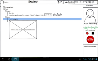
 This is the first of the two note taking ideas I have had. In this approach Andrew makes his own notes during the lecture and these notes are assembled into a tree structure. Sections of the tree can be dynamically expanded and collapsed and the notes can be easily rearranged by moving one branch to another section of the trunk.
This approach leads to a natural summarisation process and allows easy skimming of notes to find terms associated with particular topics. Information can be hidden when trying to test knowledge and Andrew only needs to go into detail in sections where he is less confident of his own knowledge.
The obvious downside of this approach is that the lecture slides that are typically provided are can't really be utilised. They could be added via photos or added as pictures but the bulk of the notes must be created by Andrew during the lectures. This approach emphasises the note principles 2 and 4. Notes are summaries of what is covered in lectures and notes are easily skimmed.
PDF Annotation
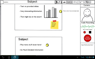
 The other approach is to use the slides provided. Assuming that either they will already be PDFs or can easily be converted into PDFs, this approach then creates a layer that is placed over the top. In Lecture Mode you simply tap a spot on the slides and start typing and this becomes an annotation. Andrew doesn't need to write down everything, he simply needs to add any particular detail that is missing from the slides. When a given note loses focus it immediately collapses into a small dot to avoid taking up too much space. It can be reselected and modified but the focus is around creating new annotations.
It is this approach that really emphasises different UIs for note taking and note (re)viewing. In a later post I will talk about my ideas for how the annotated notes would look in a non-lecture mode.
I would really appreciate feedback and thoughts on these designs and how you think they could be improved.
Wow, that PDF lecture not one sounds amazing :o It could be problematic if there is no lecture notes for a subject though, I would still be far more inclined to use the program with that particular layout.
ReplyDeleteAlso, what is the battery capability like, I love the past 90 seconds thing but constant audio recording sounds like a battery killer (but maybe not?)
I actually don't have a good read on how much this would hit the battery, but the transformer prime in the keyboard dock is meant to last about 18 hours of typical usage.
DeleteLooks like you're all set up for the recording phase of it! I'm guessing you could swap out the right pane for a different pane when you're in "note review" mode. Probably have some kind of file structure there that lets you view different notes in a series, so you don't have to save each lecture as a single note file. Maybe a search function like the one in Word 2010, to find things as well?
DeleteI really have no idea what to do with that white space at the bottom... maybe have some sort of tracker on how many pictures and audio samples you've taken so far?